Introducing FarmQA Analytics

The FarmQA development team is excited to announce the latest addition to our robust offering of digital agronomy tools: FarmQA Analytics! The Analytics feature allows users to compile and visualize the agronomic data on their FarmQA account, allowing for rapid visualization and interpretation of the user’s data.
FarmQA Analytics allows you to view trends in real time as data comes in from the field. You can set up metrics to track data your scouts are collecting in the field, such as insect counts and corn yields. You have the choice to display analyzed data in map or graphical formats, allowing for data to be interpreted how you want. Having easy access to this information can make it that much easier to make informed management decisions regarding your operation.
Setting up metrics
Prior to using FarmQA Analytics, you need to set up metrics for to track. Metrics can be set up to track data collected by the FarmQA mobile app, or they can be imported from a map layer uploaded to your enterprise. For example, you can set up a metric to track aphid counts collected in a scouting report, or you can collect data from one of your map layers that shows total rainfall from last year. Out analytics will track and analyze data as it comes in from the field if data is being collected using our scouting solution.
Determine how you want to visualize your data
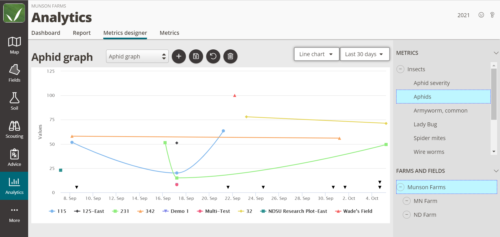
Navigate to the Metrics designer tab to visualize the data for your desired metrics. Data can be displayed in one of the following ways:
- Line Charts
- Heat Maps
- Field averages map
- Range charts
- Bar charts
Users can also set the timescale over which they want the data to be displayed. Data to be graphed and displayed can be collected from the past year, month, week, or that day. Custom ranges can also be set to give the users more control over how they want to view their data.
Analytics Dashboard
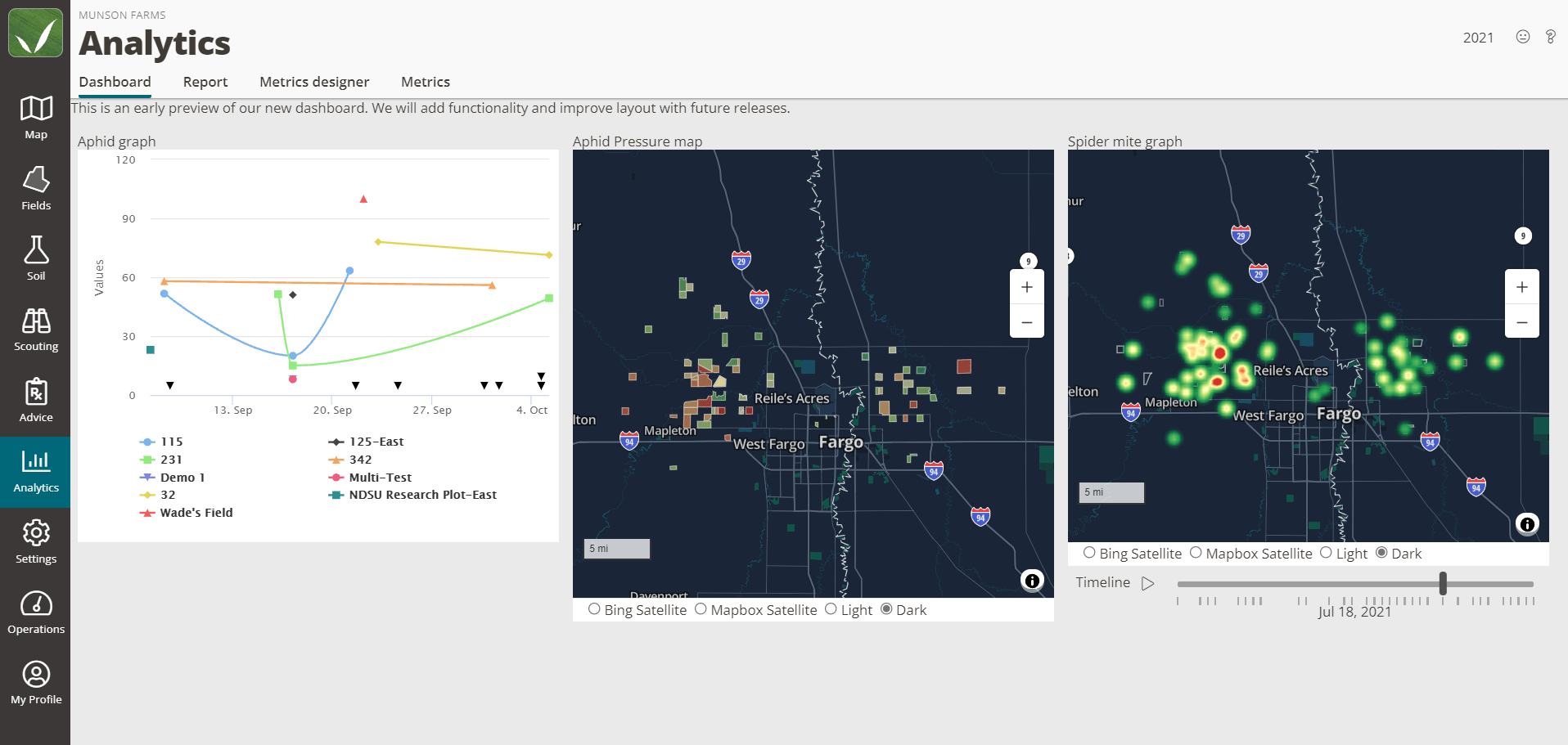
Once you have metrics set up and have determined how you want to display your data, your data visualization will be added to your Analytics Dashboard. Think of the dashboard as a quick glance at the data that matters the most to you. Maps displayed on the dashboard are fully interactive. Click on a field to see its average observed aphids over the last year or select a point on a graph to see the highest quantity of white grubs observed this season. Further dashboard functionality will be released soon.